Color Psychology in Branding | Meanings & Examples

Why do some brands feel trustworthy at first glance, while others appear energetic, luxurious, friendly, or innovative? Their products and messaging matter, but visual identity also contributes to the first impression. One of the most noticeable parts of that identity is color.
Color psychology in branding explores how people associate colors with emotions, qualities, experiences, and expectations. Businesses use these associations when choosing logo colors, website themes, packaging, advertising graphics, and other visual elements.
Blue is commonly associated with trust and stability. Red can communicate energy, urgency, or excitement. Green often suggests nature, growth, or sustainability, while yellow can create a feeling of warmth and optimism. However, these associations are not universal rules. A color's meaning can change according to its shade, surrounding colors, cultural context, industry, and the experience a person already has with a brand.
Understanding color psychology in branding and marketing can help businesses create a more consistent identity and communicate their intended personality. The goal is not simply to choose a popular color. It is to select a color system that fits the audience, product, brand positioning, and practical needs of the business.
In this guide, you will learn what color psychology means in branding, explore common color associations and real-world brand examples, compare color combinations, and discover how to choose a palette for your own business.
What Is Color Psychology in Branding?
Color psychology in branding is the study and practical application of the associations people form with colors when they encounter a brand or its visual identity.
These associations can influence how a business is perceived. For example, a company that uses deep blue, clean typography, and a restrained layout may appear professional and dependable. A children's product brand using bright yellow, orange, and playful illustrations may feel more energetic and approachable.
Color is only one part of this impression. Typography, imagery, language, product quality, customer service, and previous experiences also influence how people interpret a brand.
The same color can communicate different ideas in different settings. A bright red can feel playful on a food package but aggressive in a financial dashboard. A dark green may suggest a premium natural product, while a pale green may feel fresh and gentle.
Research into color and emotion has identified recurring associations, but it also shows that color responses depend on multiple factors. A systematic review covering 132 studies and 42,266 participants found consistent relationships between colors and emotional dimensions, while also highlighting the complexity of these associations.
Therefore, color psychology should be treated as a useful design framework rather than a guaranteed method for predicting customer behavior.
Why Color Psychology Matters in Branding and Marketing
1. It Helps Communicate Brand Personality
A brand's visual identity can communicate personality before someone reads its message. Carefully selected colors can reinforce qualities such as reliability, creativity, sophistication, friendliness, or energy.
For example, a professional consulting company may choose navy blue and neutral gray to support a serious visual identity. A creative studio may prefer purple, coral, or contrasting colors to express individuality.
The colors should support the personality the business wants to communicate rather than simply follow a trend.
2. It Helps Create Brand Recognition
Consistent use of a recognizable color palette can make a business easier to identify across its website, social media posts, packaging, advertisements, and other marketing materials.
Recognition develops through repeated exposure and consistent experiences. Color alone does not guarantee recognition, but it can become an important part of a distinctive brand identity.
3. It Supports Visual Consistency
A defined color system helps teams create materials that look related, even when different people design them.
For example, a brand might use one primary color for its logo and main visual elements, a secondary color for supporting sections, and an accent color for selected buttons or highlights.
This approach creates consistency across digital and printed materials.
4. It Can Influence Expectations
Customers may use visual signals to form expectations about a product before they have tried it. A minimal black-and-gold package may suggest a premium product, while a colorful package may appear playful or accessible.
These impressions are not proof of actual quality. The product, price, claims, packaging quality, and overall customer experience must support the expectations created by the design.
5. It Can Improve Communication in Digital Marketing
Color can help distinguish headlines, calls to action, navigation, promotions, and other important elements in a digital experience.
However, visibility and usability matter more than choosing a supposedly persuasive color. A button must be easy to identify, readable, and consistent with the interface. Its label and placement should clearly communicate what happens when someone clicks it.
Color Psychology in Branding: Meanings of Different Colors
The following chart summarizes common color associations and potential branding applications. These are starting points for design decisions, not universal meanings.
Branding Color Psychology Chart
| Color | Common Associations | Possible Branding Uses |
|---|---|---|
| Blue | Trust, stability, calmness, professionalism | Technology, finance, business services |
| Red | Energy, excitement, urgency, passion | Food, entertainment, promotions |
| Yellow | Optimism, warmth, attention | Children's products, creative brands |
| Green | Nature, growth, freshness, sustainability | Gardening, environmental products, wellness |
| Orange | Enthusiasm, friendliness, activity | Lifestyle, sports, accessible services |
| Purple | Creativity, individuality, luxury | Beauty, creative services, premium products |
| Black | Sophistication, strength, elegance | Fashion, luxury goods, modern technology |
| White | Simplicity, cleanliness, openness | Healthcare, minimalist products, digital services |
| Gray | Neutrality, restraint, professionalism | Corporate services, technology, industrial brands |
| Brown | Earthiness, warmth, craftsmanship | Coffee, wood products, handmade goods |
| Pink | Playfulness, softness, romance, individuality | Beauty, fashion, lifestyle products |
| Teal | Calmness, freshness, balance | Digital services, wellness, contemporary brands |
The context is important. A brand should test its actual color palette with its intended audience instead of assuming that every customer will interpret a color in the same way.
Blue Color Psychology in Branding
Blue is often associated with trust, stability, calmness, and professionalism. It is a common option for companies that want to communicate reliability and clarity.
Technology businesses, financial services, educational organizations, and professional service providers may use blue to support these qualities. Different shades create different impressions: navy can feel formal and established, while brighter blue can feel energetic and modern.
Blue is not automatically the right choice for every business. If an entire industry relies on similar blue palettes, a distinctive alternative may help a new brand stand out.
When choosing blue, consider the audience, the competition, and how the color works with the logo, typography, and background.
Red Color Psychology in Branding
Red can communicate energy, excitement, passion, urgency, or intensity. It can attract attention when used strategically, which makes it useful in selected branding and promotional contexts.
Food businesses, entertainment brands, sports organizations, and retail campaigns may use red to create a bold visual identity.
However, too much saturated red can make an interface feel visually intense. In digital design, it is often useful to balance red with neutral backgrounds or use it selectively for important elements.
Red can also communicate danger or errors in interfaces. Designers should therefore consider the meaning red already has within a particular product or context.
Yellow Color Psychology in Branding
Yellow is commonly associated with sunshine, optimism, warmth, and attention. It can give a brand a bright, approachable personality.
Businesses targeting families, creative audiences, or customers looking for a lively experience may consider yellow as part of their palette.
The practical challenge is readability. Bright yellow backgrounds can make white text difficult to read, and some yellow shades work poorly for small text or thin icons.
A more effective approach may be to use yellow as an accent against a darker color, or pair it with a carefully selected dark text color.
Green Color Psychology in Branding
Green often suggests nature, growth, freshness, renewal, and sustainability. It can be appropriate for gardening businesses, environmentally focused products, food brands, and wellness services.
Light green may feel fresh and energetic, while deeper green can create a more traditional or premium impression.
Nevertheless, green does not prove that a product is natural, healthy, or environmentally responsible. A brand's claims should be accurate and supported by its actual practices.
When choosing green for branding, consider whether it fits the product and whether competing brands already use similar shades.
Orange Color Psychology in Branding
Orange can communicate enthusiasm, warmth, friendliness, and activity. It may suit businesses that want to appear energetic and approachable.
It can be used in sports branding, lifestyle products, food businesses, creative services, and selected ecommerce interfaces.
Orange often works well as an accent because it is visually noticeable. When used across every part of a design, however, it can become overwhelming.
Try combining orange with a restrained neutral palette or a complementary darker shade to create a more balanced visual identity.
Purple Color Psychology in Branding
Purple is often associated with creativity, individuality, imagination, and certain forms of luxury. Its impression depends heavily on the exact shade and surrounding design.
Deep purple paired with restrained typography may support a premium identity. Brighter purple can feel expressive, playful, or technology-oriented.
Beauty brands, creative businesses, and lifestyle companies may use purple to establish a distinctive visual style.
Purple is not inherently luxurious. Typography, materials, photography, packaging, and product quality all contribute to whether a brand actually feels premium.
Black Color Psychology in Branding
Black can communicate sophistication, strength, elegance, simplicity, or authority. It is commonly used in fashion, premium packaging, photography, and modern digital products.
A black-and-white identity can be highly flexible because it works across many formats. Adding one accent color can help create a more recognizable personality.
However, large areas of black can make some designs feel heavy, and black text on dark backgrounds creates readability problems.
Use black intentionally, and evaluate the palette in both digital and print applications.
White and Gray in Branding
White often supports impressions of simplicity, openness, cleanliness, and clarity. Gray can communicate neutrality, restraint, and professionalism.
Both are useful supporting colors because they allow other elements to stand out. A brand can use white as its main background, gray for secondary information, and one distinctive color for important actions or visual highlights.
These colors still need careful selection. Very pale gray text can be difficult to read against white, while a design made entirely from neutral shades may lack distinction if its typography, imagery, and layout are also generic.
Brown and Teal in Branding
Brown often suggests earthiness, warmth, natural materials, and craftsmanship. It may suit coffee brands, handmade products, furniture businesses, and businesses built around traditional materials.
Teal combines aspects of blue and green. Depending on its shade, it can feel calm, fresh, balanced, or contemporary. It may work well for wellness businesses, digital products, and brands looking for an alternative to standard blue.
As with other colors, the best choice depends on the complete visual identity rather than the color name alone.
Color Psychology in Branding Examples
Real-world brands provide useful examples of how colors become part of a larger identity. The examples below describe recognizable visual choices; they should not be interpreted as proof that color alone caused a particular business result.
1. Coca-Cola: Red as a Distinctive Brand Color
Coca-Cola is widely recognized for its red-and-white visual identity. Red creates a bold and noticeable appearance, while white provides contrast and helps keep the identity clear.
The brand's recognition comes from more than color. Its logo, typography, packaging, advertising history, and consistent presentation all contribute to its identity.
Lesson: A distinctive color becomes more useful when it is applied consistently alongside other recognizable brand elements.
2. Facebook: Blue in Digital Branding
Facebook's familiar blue identity demonstrates how a color can become associated with a digital platform through repeated exposure.
Blue is commonly associated with stability and calmness, but the exact reasons a person trusts or uses a platform involve many factors beyond its color.
Lesson: Choose colors that fit the experience you want to create, then use them consistently across the interface and marketing materials.
3. Starbucks: Green in Brand Recognition
Starbucks uses green prominently in its visual identity. Green can evoke nature and freshness, but its meaning in this case is reinforced by the company's logo, stores, packaging, and repeated brand exposure.
Lesson: A brand's color should work together with its symbols, customer experience, and wider visual system.
4. McDonald's: Red and Yellow
McDonald's is associated with a red-and-yellow brand palette. These colors are visually prominent and can support an energetic, accessible appearance.
The company's identity also depends on its distinctive arches, advertising, menu, restaurants, and global presence.
Lesson: A color combination can be recognizable when the colors, logo, and overall presentation reinforce each other.
5. Luxury Fashion Brands: Black and Neutral Palettes
Many luxury fashion identities use black, white, and other restrained colors. These palettes can support an impression of sophistication, especially when combined with carefully designed typography, photography, packaging, and materials.
Black does not automatically make a brand luxurious. The complete presentation needs to support the intended positioning.
Lesson: Color should reinforce the quality and personality of the product rather than substitute for them.
How to Choose the Right Colors for Your Brand
Choosing a brand palette is a practical design process. Instead of selecting colors only because they look attractive, use the following steps to connect color decisions with business goals.
Step 1: Define Your Brand Personality
Write down three to five qualities you want people to associate with your business.
- Reliable and professional
- Friendly and approachable
- Creative and unconventional
- Premium and sophisticated
- Natural and sustainable
- Energetic and youthful
These qualities provide a starting point for choosing colors. A professional financial service and a playful children's toy brand may need very different visual identities.
Step 2: Understand Your Target Audience
Think about the people your brand serves, including their expectations, needs, cultural background, and familiarity with your industry.
A color that feels modern to one audience may feel unfamiliar to another. If your business operates internationally, do not assume that color symbolism remains identical across cultures.
When possible, ask representative customers to compare design options and explain what each one communicates to them.
Step 3: Research Competitors
Review the logos, websites, packaging, and advertisements of businesses in your industry.
Identify common color patterns and look for opportunities to create a distinctive identity. Using a different color is not always necessary, but your complete palette should help customers distinguish your brand from alternatives.
Avoid copying a competitor's recognizable identity.
Step 4: Select a Primary Color
Choose one primary color that supports your brand personality and works across your most important applications.
For example, a technology consultancy might explore navy blue, a sustainable gardening business might explore green, and a creative studio might explore purple or orange.
These are starting points, not mandatory industry rules. Test multiple options before making a final decision.
Step 5: Build a Balanced Color Palette
Most brands need more than one color. A practical palette can include:
- Primary color: The main color associated with the brand.
- Secondary color: A supporting color that adds variety.
- Accent color: A color used selectively for emphasis.
- Neutral colors: Backgrounds, text, borders, and supporting sections.
For example, a digital service could combine navy blue, pale blue, white, and a restrained orange accent. An eco-conscious product brand might explore forest green, warm beige, cream, and dark brown.
The exact proportions should depend on the design and the role of each color.
Step 6: Test the Palette in Real Applications
Do not judge brand colors only by looking at small swatches. Apply them to a logo, website header, product packaging, social media post, and other materials the business will actually use.
Check how they appear on mobile screens and desktop displays. For print products, review physical samples where possible.
A palette that looks appealing in a design tool may not work equally well in every application.
Step 7: Check Readability and Accessibility
Brand colors must remain usable. Small text, buttons, icons, forms, and important information should be easy to see.
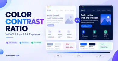
The W3C Web Content Accessibility Guidelines (WCAG) specify a minimum contrast ratio of 4.5:1 for normal text and 3:1 for large text under Success Criterion 1.4.3, subject to the standard's exceptions.
You can use a color contrast checker to evaluate foreground and background combinations before publishing a website.
Do not rely on color alone to communicate errors, success states, or other important information. Use text, icons, labels, or other visual cues where appropriate.
Step 8: Document Your Brand Colors
Once your palette is approved, create a simple brand color guide.
Include the color name, HEX code, RGB values, intended usage, and examples of acceptable combinations. You can also document which colors should be used for backgrounds, text, links, buttons, and supporting graphics.
This makes it easier to maintain a consistent identity as the business grows. You can choose and inspect individual colors and use the RGB to HEX converter when working with different color formats.
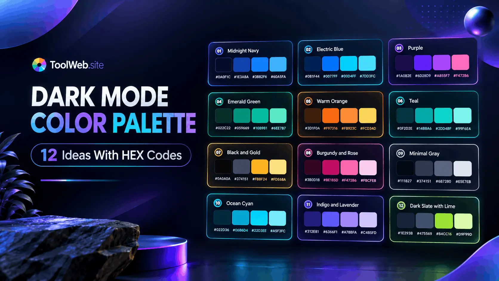
Sample Brand Color Palettes With HEX Codes
The following palettes are illustrative starting points. They are not validated color-performance claims; test each combination in its intended application.
Palette 1: Professional Technology Brand
- Navy Blue: #17324D
- Blue: #2878B5
- Light Blue: #E8F3FA
- White: #FFFFFF
- Dark Gray: #263238
Suitable starting point for: Technology services, consulting, and business software.
Palette 2: Natural and Sustainable Brand
- Forest Green: #245C45
- Sage Green: #9DB7A5
- Cream: #F6F1E7
- Earth Brown: #795548
- Charcoal: #30352F
Suitable starting point for: Gardening, natural products, and environmentally focused businesses.
Palette 3: Creative and Energetic Brand
- Purple: #6941C6
- Orange: #F28C28
- Soft Lavender: #EAE2FF
- White: #FFFFFF
- Deep Charcoal: #29233A
Suitable starting point for: Creative studios, digital creators, and selected lifestyle businesses.
Palette 4: Premium and Minimal Brand
- Black: #171717
- Warm Gray: #77716C
- Cream: #F5F0E8
- Gold: #B49355
- White: #FFFFFF
Suitable starting point for: Fashion, premium packaging, and minimalist product identities.
Before using any palette for a website, check the contrast of actual text and background combinations. A palette can look harmonious while still creating readability problems. You can also explore a color chart or use the color wheel to explore color relationships.
Common Mistakes in Color Psychology for Branding
Choosing Colors Only Because They Are Trending
Trends can provide inspiration, but a trendy palette may not fit your audience or long-term brand positioning. Choose colors that support your identity and can be used consistently over time.
Assuming One Color Has the Same Meaning Everywhere
Color associations vary with context, culture, shade, saturation, and personal experience. Treat general color meanings as hypotheses to test rather than universal facts.
Using Too Many Colors
A large number of competing colors can make a visual identity feel inconsistent. Start with a small, purposeful palette and add more colors only when they serve a clear role.
Ignoring Competitors
A palette may fit your industry but look almost identical to several established competitors. Research the visual landscape and look for a way to remain relevant while being recognizable.
Sacrificing Accessibility for Appearance
Pale text, low-contrast buttons, and color-only warnings can make a website difficult to use. Check readability and contrast before finalizing your design.
Expecting Color Alone to Increase Sales
Color can contribute to a brand's presentation, but it does not guarantee more conversions, stronger trust, or higher revenue. Product quality, pricing, usability, messaging, customer experience, and audience fit also matter.
How to Use Color Psychology in Marketing and Branding
Color psychology becomes most useful when applied consistently across the customer journey.
Website Design
Use the primary brand color in a consistent way across the header, navigation, and key brand elements. Select supporting colors for page backgrounds and secondary information.
Calls to action should be easy to recognize, but the most effective color depends on the surrounding interface. Test the complete design instead of assuming that one particular button color always performs better.
Logo Design
A logo should be recognizable, appropriate for the brand, and adaptable to different sizes and backgrounds.
Test the logo in color, grayscale, and single-color versions. A strong identity should not depend entirely on subtle color differences to remain recognizable.
Product Packaging
Packaging colors help establish the visual character of a product and may affect the expectations customers form before using it.
Consider the product category, target audience, shelf visibility, materials, printing limitations, and competitor packaging. Make sure important information remains readable.
Social Media and Advertising
Use a consistent color system across social posts, promotional banners, and advertisements. Accent colors can help distinguish key messages, while neutral backgrounds can prevent designs from becoming cluttered.
Keep text readable on mobile devices and ensure that the message itself communicates the offer clearly.
Ecommerce Product Pages
For ecommerce stores, color can support navigation, product categories, pricing information, and calls to action.
However, shoppers need accurate product photography and clear descriptions. If a product's actual color matters, show it as accurately as possible rather than relying on a decorative brand palette.
How to Measure Whether Your Brand Colors Are Working
A palette should be evaluated through real use, not just personal preference.
Consider these practical methods:
- Audience feedback: Show alternative designs to representative customers and ask what qualities each design communicates.
- Recognition testing: Check whether people can identify your brand's materials when the name or logo is less prominent.
- Usability testing: Observe whether people can read important information and identify buttons, links, and form states.
- Controlled experiments: If your website has enough traffic, test one design variation at a time and compare meaningful outcomes.
- Consistency audits: Review your website, packaging, email templates, and social media materials to see whether they follow the same color rules.
Avoid drawing strong conclusions from a handful of responses or a small experiment. Results can be affected by audience differences, sample size, the wording of a message, placement, and many other factors.
The goal is to find a color system that supports brand recognition, communicates the intended personality, and remains practical for customers to use.
Frequently Asked Questions
1. What is color psychology in branding?
Color psychology in branding is the study and application of color associations in a brand's visual identity. It helps businesses consider how colors may communicate personality, mood, and expectations across logos, websites, packaging, and marketing materials.
2. Why is color psychology important in branding and marketing?
Color can contribute to first impressions, visual recognition, and consistency across marketing channels. Its impact depends on context, audience, design, and the complete brand experience, so it should not be treated as a guaranteed way to influence purchasing decisions.
3. What color is best for branding?
There is no single best color for every brand. The right choice depends on your target audience, brand personality, industry, competitors, product, and design requirements. Choose a color that fits your positioning and test it in real applications.
4. What does blue mean in branding?
Blue is commonly associated with trust, stability, calmness, and professionalism. Businesses may use it to support these qualities, but the shade, context, audience, and complete visual identity influence how people interpret it.
5. What does yellow mean in branding?
Yellow is often associated with warmth, optimism, and attention. It can create a bright visual identity, but its readability depends on the foreground and background colors used alongside it.
6. How do brands use color psychology?
Brands use color in logos, websites, packaging, advertisements, and other visual materials to support a consistent identity. Good color choices align with the brand's intended personality and remain readable and recognizable across applications.
7. What is a branding color psychology chart?
A branding color psychology chart summarizes common color associations and possible branding uses. It is a starting point for design decisions, not a universal guide to how every customer will respond.
8. How many colors should a brand use?
A practical starting point is one primary color, one or two supporting colors, an accent color, and suitable neutrals. The ideal number depends on the brand's needs, but every color should have a clear purpose.
9. Does color psychology affect buying decisions?
Color may contribute to product impressions and expectations, but purchasing decisions depend on many factors, including price, quality, relevance, convenience, messaging, and previous experience. No single color guarantees a purchase.
10. How can I choose brand colors for a website?
Start by defining the brand personality and audience. Choose a primary color, build a balanced supporting palette, test the colors in actual layouts, and check text contrast and accessibility before publishing.
11. Should a business follow color trends?
Trends can provide inspiration, but long-term brand colors should fit the business and remain useful across different materials. A trend is not a substitute for audience research or a clear visual identity.
12. Can I use the same brand colors for my website and logo?
Yes. Using a consistent color system across your logo, website, social media, and packaging can help create a unified identity. You may need different color variants for backgrounds, accessibility, printing, or particular applications.
Final Thoughts
Color psychology in branding provides a useful framework for making more intentional visual decisions. Blue can support a sense of reliability, red can create energy, green can suggest nature, and yellow can introduce warmth. Yet these associations depend on the audience and context, and no color automatically creates trust, luxury, or sales.
The most effective approach is to define your brand personality, understand your audience, review competitors, build a balanced palette, and test the result across real applications. Accessibility and consistency should remain part of the process from the beginning.
If you are developing a new brand or refreshing an existing identity, start with a small set of purposeful colors and document how each should be used. A thoughtful color system can help your business communicate more clearly and build a recognizable visual identity over time.